I keep three species of poison frogs (they are not poisonous in captivity – they are not on the same diet required to form their poisons) from the Ranitomeya genus:
Ranitomeya reticulata
Ranitomeya summersi “nominal”
Ranitomeya fantastica “nominal”
There was a recent reclassification of some species based on a phylogenomic analysis of the evolution of the Ranitomeya genus; the summary graphic from the article is beautiful and useful at the same time.
Google Sheets has native support for sparklines. This is more versatile than the Excel implementation, which has me torn – plotting in Excel is MUCH better than plotting in Sheets, but the sparklines in Sheets is better than Excel. I thought I would take you through an example of how I’m leveraging sparklines in Google Sheets in this post.
Plotting all you data can be hard. Some think it’s pointless. Some think it’s a waste of time. Some think generic dashboards are better. Some think logging is more precise.
Nothing can replace a well designed scatter plot as a critical diagnostic tool.
I came across this plot the other day while reading an article about LinkedIn on fastcompany.com. What struck me (other than the poor labeling on a vertically oriented phone) was the lack of significance of the vertical sort on the plot. Continue reading
I was reading this interesting study on the impact of fear on the stability of a food web which led me to start thinking about principles of sound experimental design, and how such designs can yield valuable insight into a variety of systems, natural or man made. From the authors:
When it comes to conserving biodiversity and maintaining healthy ecosystems, fear has its uses. By inspiring fear, the very existence of large carnivores on the landscape, in and of itself, can provide a critical ecosystem service human actions cannot fully replace, making it essential to maintain or restore large carnivores for conservation purposes on this basis alone.
The experimental design behind this study was fascinating. Using two islands off the coast of British Columbia, Canada, the team setup an experiment:
Yes, Ambari Metrics is a horrid, terrible information presentation platform that needs a major overhaul. I am not sure who it was designed for, but it was not for data scientists interested in cluster performance. I really appreciate the work Hortonworks has invested in making hadoop more approachable as a platform, but I was really disappointed in the gutting of Ganglia/Nagios capabilities when the replacement, Ambari Metrics, was just not capable of providing the diagnostic capabilities and layered access to data that Ganglia provided.
I am a dart frog addict…er…hobbyist. You can read more about my involvement in the hobby here, but one aspect of the hobby that intersects with my analytics background is weather data. I try to locate weather stations near the regions in South America where the frogs I keep were originally collected. This has led to some interesting visualizations, including this one, regional weather data for Sao Lourenco:
I’m a big proponent of Edward Tufte and his information design principles. I’ve included a few key concepts in this post from Tufte’s writings that I have found useful in developing my own visualization techniques and strategies.
I’ve spent most of my career integrating, developing and tuning a variety of software and hardware products that support core infrastructure applications. For the past 10 years I have been able to focus on aggregating data across complex infrastructure stacks and developing techniques for enhancing our visual representation of these large scale data sets.
My philosophy has focused on viewing the entire data set for rapid assessment of the behavior of a system. This focus has been on the performance of high scale systems, mostly delving into low level profiling of transactional latency patterns for OLTP style applications. Though my ultimate goal is to provide rapid solutions to my customers for their performance issues, I also strive to make the representation of their data sets comprehensive, visual, clear, and interesting to view.
I’ve compiled a sample of some of the data visualization projects I have taken on over the years, applying a variety of techniques championed by Edward Tufte to these data sets. Hopefully you’ll find looking at these data visualizations as much fun as I had building them.
Some of my favorite visualizations
Click the title to see the graphic and description.
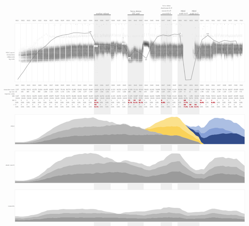
Fault injection testing on kubernetes
This is a time series summary of multiple layers of metrics during fault injection testing on a kubernetes deployment.
Project timeline and outcome
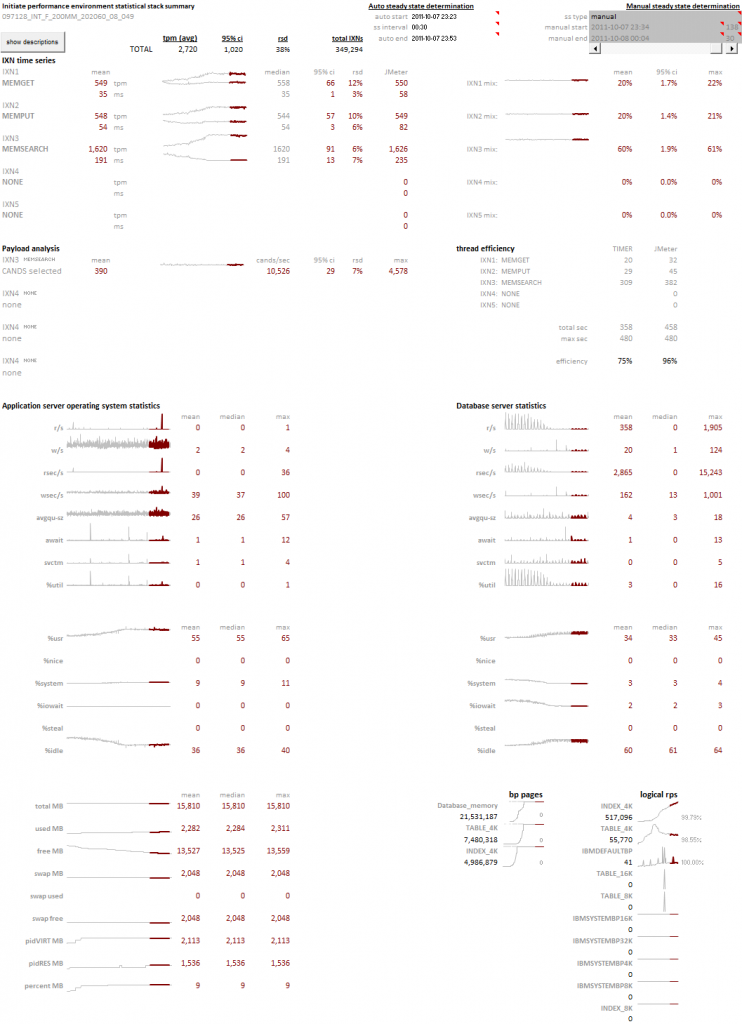
In this visualization I have combined combined a project timeline with test results from a workload profiling sequence following the deployment and tuning of an application on a clustered database environment for the first time. This is an information rich view of the project outcome that illustrates the progress made over the duration of the engagement. Tools like these are helpful in explaining software deployment cycles and the tuning investments required for at-scale projects.
Name token count regression study
An interesting example of the use of linear regression analysis to identify the normalized comparison latency for a person-search workload as the number of tokens in a name is increased. This experiment design was used to compare a baseline comparison function COMP1 to multiple tuning efforts of a new comparison, COMP2.
Weather data
This is an example of the visualization of daily weather readings spanning a decade’s worth of data from a weather station in Brazil. The objective of this plot was to identify seasonal weather patterns in a specific region and the subsequent replication of these patterns in a controlled environment.
Fault injection testing on DB2 Purescale
This visualization focused on illustrating the impact of fault injection during a cluster test. Faults include the soft and hard removal of nodes from a clustered database while three types of transactions were issued against a dataset stored on the cluster. Impacts to the workload were noted, as well as recovery times. Additional CPU metrics from the application and database tiers were presented below the transactional time series plots.
Impact of store openings on transaction rates
A transactional summary view of API calls from a B2C nationwide search workload. This visualization illustrates the ramp up of traffic (light gray) as the day progresses, and the stabilization of transactional search latency (dark gray) as the database buffer pools warm and the physical read rate drops. My favorite portion of this visualization is the illustration of the impact of store openings across time zones in the United States on the transaction rate.
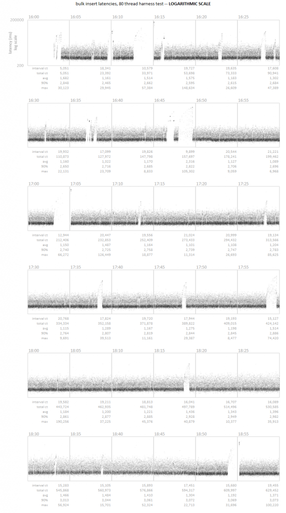
Time series scatter plot
A time series latency scatter plot that allows for the visualization of all transactional latency values captured over the course of three hours. In this particular case, the customer was unable to detect a series of micro-outages using their standard 5 minute sample interval. Visualizing the entire data set allowed for the rapid identification of the pattern.
Edward Tufte has written extensively on the use of small multiples and sparklines. These concepts, the use of many small plots using a consistent pattern allows you to quickly survey large amounts of data for abnormal patterns. The concept focuses on how our eye can parse large numbers of micro plots and quickly assess an abnormal pattern – it’s an innate ability that all people have. We can leverage this ability by creating visualizations that present consistent patterns to the viewer, and subtly illustrate abnormalities that anyone can observe.
Time for a new twist on an old concept…the Gantt Chart. Tried and true, we’re used to seeing it used for old waterfall planning models. However, we can take a project chart for a large scale POC of an MDM application housing 250 million records on a new clustered database. The schedule was extremely aggressive with an original target of three weeks, which, due to delays in database deployments and JDBC/ODBC connectivity issues stretched to 5 weeks.
Can you build a visualization that conveys the complexity of a project involving a dozen technical people, hundreds of tests, with distinct goals?
Hey, I’m a data guy – you know what the answer is going to be…


 I am a dart frog addict…er…hobbyist. You can read more about my involvement in the hobby here, but one aspect of the hobby that intersects with my analytics background is weather data. I try to locate weather stations near the regions in South America where the frogs I keep were originally collected. This has led to some interesting visualizations, including this one, regional weather data for Sao Lourenco: