Abraham Wald and his work on WWII bomber damage is a really cool story highlighting why we need to always challenge the way we look at data and consider what our data is really telling us, and what data we may be missing.

jim o'neill | austin texas
Abraham Wald and his work on WWII bomber damage is a really cool story highlighting why we need to always challenge the way we look at data and consider what our data is really telling us, and what data we may be missing.
We’ve been keeping an eye on the reported cases coming out of our kids’ school district, Leander ISD. Living in Texas, the mitigation steps taken to contain the spread of COVID-19 is minimal:
The relative lack of mitigation efforts alarmed us, so we started taking a closer look at what data was available from the district that we could use to better inform ourselves of what was going on in our school, and the schools around us.
Continue readingPlotting all you data can be hard. Some think it’s pointless. Some think it’s a waste of time. Some think generic dashboards are better. Some think logging is more precise.
Nothing can replace a well designed scatter plot as a critical diagnostic tool.
Continue reading
I was reading this interesting study on the impact of fear on the stability of a food web which led me to start thinking about principles of sound experimental design, and how such designs can yield valuable insight into a variety of systems, natural or man made. From the authors:
When it comes to conserving biodiversity and maintaining healthy ecosystems, fear has its uses. By inspiring fear, the very existence of large carnivores on the landscape, in and of itself, can provide a critical ecosystem service human actions cannot fully replace, making it essential to maintain or restore large carnivores for conservation purposes on this basis alone.
The experimental design behind this study was fascinating. Using two islands off the coast of British Columbia, Canada, the team setup an experiment:
Continue readingThis was a recent highly publicized event here are 4 year old kid in Egypt was sentenced to life in prison because of, well, really crappy entity resolution:
http://www.bbc.com/news/world-middle-east-35633314
This issue was essentially caused by a match on name (and not even exact), while no other consideration was given to other attributes that would have clearly shown the child that was sentenced was not the actual target. Here are the names referenced in the BBC report in the link I embedded above:
Continue readingIf you are into Entity Analytics (like I am) then a cursory understanding of Zipf’s Law should be a tool in your bag. It’s a really cool mathematical relationship that governs most of the distributions you will encounter in our line of work, mainly dealing with natural data sets that follow a consistent frequency distribution.
A Fermi Estimate or Fermi Problem is named after physicist Enrico Fermi developed the method while estimating the yields of atomic bomb blasts. He used an estimation method to estimate the a method for scientists or engineers to come up with a rapid estimate for an answer to a problem where a precise measurement is not possible.
Yes, Ambari Metrics is a horrid, terrible information presentation platform that needs a major overhaul. I am not sure who it was designed for, but it was not for data scientists interested in cluster performance. I really appreciate the work Hortonworks has invested in making hadoop more approachable as a platform, but I was really disappointed in the gutting of Ganglia/Nagios capabilities when the replacement, Ambari Metrics, was just not capable of providing the diagnostic capabilities and layered access to data that Ganglia provided.
Here’s the monitoring console I’m unhappy with:
Continue reading I am a dart frog addict…er…hobbyist. You can read more about my involvement in the hobby here, but one aspect of the hobby that intersects with my analytics background is weather data. I try to locate weather stations near the regions in South America where the frogs I keep were originally collected. This has led to some interesting visualizations, including this one, regional weather data for Sao Lourenco:
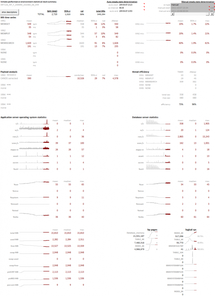
Edward Tufte has written extensively on the use of small multiples and sparklines. These concepts, the use of many small plots using a consistent pattern allows you to quickly survey large amounts of data for abnormal patterns. The concept focuses on how our eye can parse large numbers of micro plots and quickly assess an abnormal pattern – it’s an innate ability that all people have. We can leverage this ability by creating visualizations that present consistent patterns to the viewer, and subtly illustrate abnormalities that anyone can observe.
Continue reading
Time for a new twist on an old concept…the Gantt Chart. Tried and true, we’re used to seeing it used for old waterfall planning models. However, we can take a project chart for a large scale POC of an MDM application housing 250 million records on a new clustered database. The schedule was extremely aggressive with an original target of three weeks, which, due to delays in database deployments and JDBC/ODBC connectivity issues stretched to 5 weeks.
Can you build a visualization that conveys the complexity of a project involving a dozen technical people, hundreds of tests, with distinct goals?
Hey, I’m a data guy – you know what the answer is going to be…
© 2025 tertiary analytics
Theme by Anders Noren — Up ↑