A Fermi Estimate or Fermi Problem is named after physicist Enrico Fermi developed the method while estimating the yields of atomic bomb blasts. He used an estimation method to estimate the a method for scientists or engineers to come up with a rapid estimate for an answer to a problem where a precise measurement is not possible.
Author: jim (Page 2 of 2)
This was an interesting podcast from Dr. Art Markman and Dr. Bob Duke from UT Austin – they are featured on a weekly podcast on KUT Austin titled Two Guys on Your Head that typically covers really interesting topics. This podcast focused on low information decision making and how people with expertise in certain fields can rely on a variety of experiences to process many variables in reaching a decision. Most of this decision making is difficult for a person to verbalize, and even more challenging to replicate programmatically.
Interesting stuff. Have a listen:
[soundcloud]https://soundcloud.com/kutnews/two-guys-on-your-head-low-information-decision-making[/soundcloud]
I’m Jim O’Neill, and this is my blog that focuses on entity and workload analytics. I have spent a decade working on high scale entity resolution engines, tuning both the accuracy and performance of large scale deployments that handle billions of records and trillions of comparisons.
Tertiary Analytics, is a nod to the KT extinction, an event that saw the end of the dinosaurs and rise of mammals. Large scale computing platforms are at a similar inflection point, as we shift from high dollar, on premise solutions, to low cost, cloud based solutions, providing an even greater opportunity to leverage analytical principles in how we explore entity composition and relationships, and deploy and manage workloads.
If you like reading C.V.’s or resumes, then you can find mine here. You can find more information on me on my personal website as well.
Yes, Ambari Metrics is a horrid, terrible information presentation platform that needs a major overhaul. I am not sure who it was designed for, but it was not for data scientists interested in cluster performance. I really appreciate the work Hortonworks has invested in making hadoop more approachable as a platform, but I was really disappointed in the gutting of Ganglia/Nagios capabilities when the replacement, Ambari Metrics, was just not capable of providing the diagnostic capabilities and layered access to data that Ganglia provided.
Here’s the monitoring console I’m unhappy with:
Continue readingThis post is a summary of my putzing around with a home built set of cheap low power nodes that I wanted to use as a 4 node hadoop cluster. My primary objective was to learn more about managing a hadoop cluster and to use the cluster for data analysis of some weather data I have been collecting for my frog locales. I wanted more experience with Python and R, so it seemed like this would be a good gear head project to take on. Continue reading
My dear, there is much that is unexplained. Until it is.
walter bishop
 I am a dart frog addict…er…hobbyist. You can read more about my involvement in the hobby here, but one aspect of the hobby that intersects with my analytics background is weather data. I try to locate weather stations near the regions in South America where the frogs I keep were originally collected. This has led to some interesting visualizations, including this one, regional weather data for Sao Lourenco:
A great piece from KUT’s Two Guys on Your Head on why failure is important in education. Our propensity for avoiding mistakes, and teaching our children that failure is not ok, leads to a lack of training in experimentation. There’s a great analogy in this bit on the use of training wheels on a child’s bike to allow for limited failure (tipping from side to side) while preventing catastrophic failure (falling over).
[soundcloud]https://soundcloud.com/kutnews/tgoyh101813[/soundcloud]
Often the most effective way to describe, explore, and summarize a large set of numbers – even a very large set – is to look at pictures of those numbers.
edward r tufte
I’m a big proponent of Edward Tufte and his information design principles. I’ve included a few key concepts in this post from Tufte’s writings that I have found useful in developing my own visualization techniques and strategies.
Continue reading
I’ve spent most of my career integrating, developing and tuning a variety of software and hardware products that support core infrastructure applications. For the past 10 years I have been able to focus on aggregating data across complex infrastructure stacks and developing techniques for enhancing our visual representation of these large scale data sets.
My philosophy has focused on viewing the entire data set for rapid assessment of the behavior of a system. This focus has been on the performance of high scale systems, mostly delving into low level profiling of transactional latency patterns for OLTP style applications. Though my ultimate goal is to provide rapid solutions to my customers for their performance issues, I also strive to make the representation of their data sets comprehensive, visual, clear, and interesting to view.
I’ve compiled a sample of some of the data visualization projects I have taken on over the years, applying a variety of techniques championed by Edward Tufte to these data sets. Hopefully you’ll find looking at these data visualizations as much fun as I had building them.

Some of my favorite visualizations
Click the title to see the graphic and description.
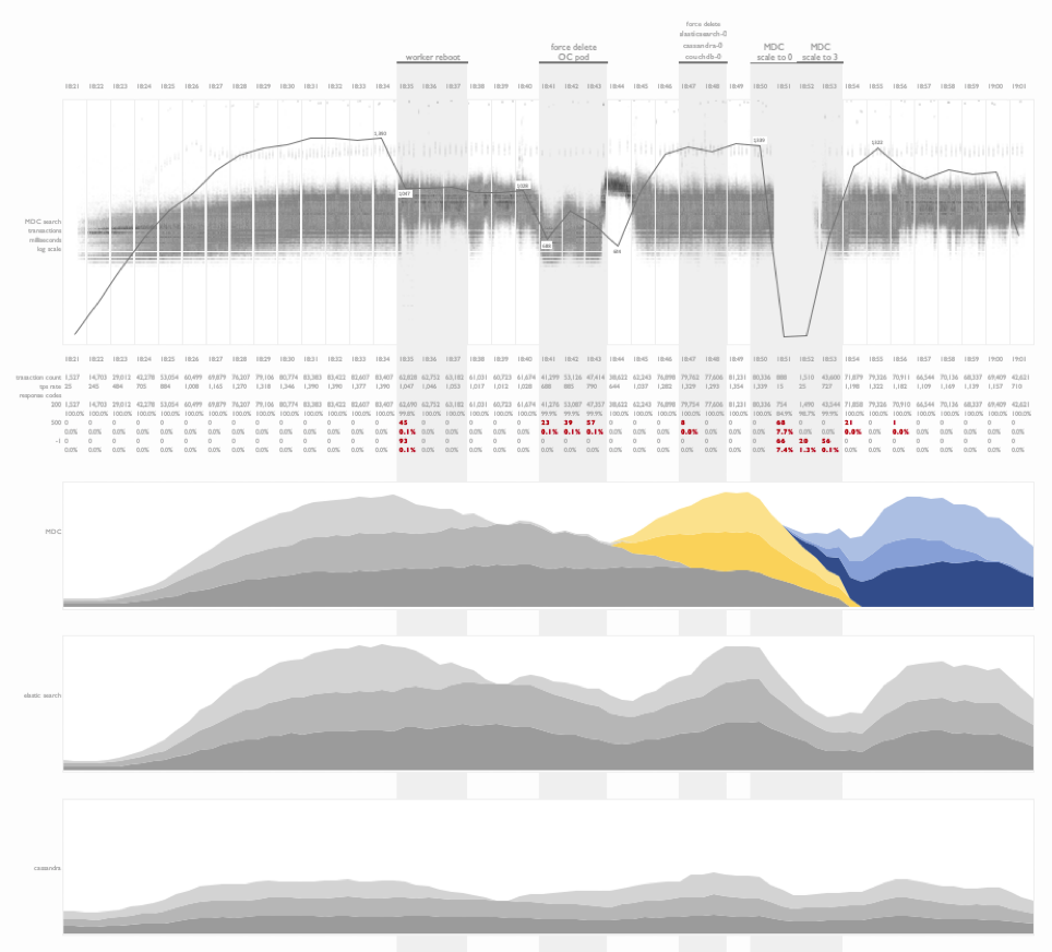
Fault injection testing on kubernetes
This is a time series summary of multiple layers of metrics during fault injection testing on a kubernetes deployment.
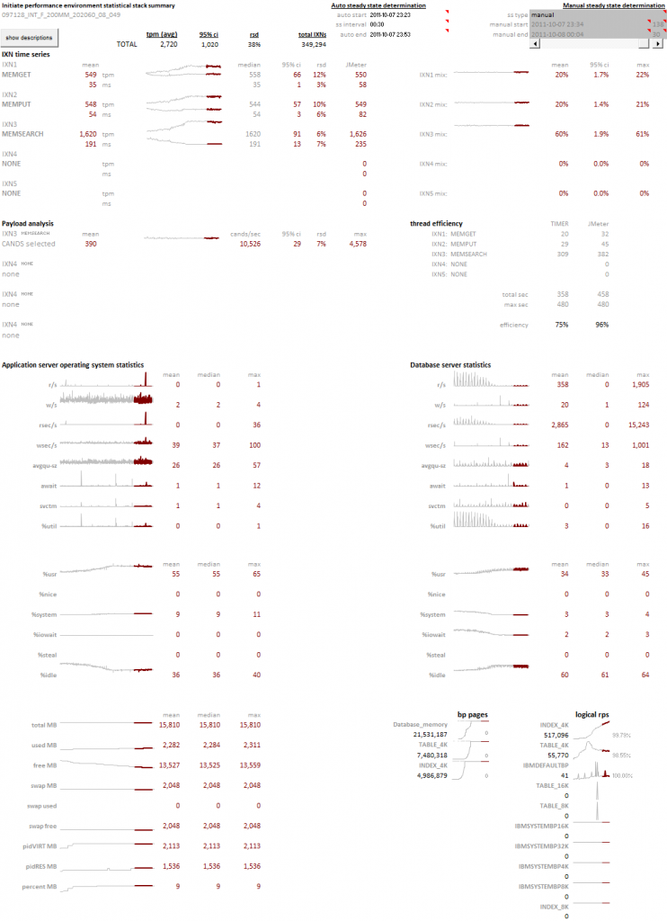
Project timeline and outcome
In this visualization I have combined combined a project timeline with test results from a workload profiling sequence following the deployment and tuning of an application on a clustered database environment for the first time. This is an information rich view of the project outcome that illustrates the progress made over the duration of the engagement. Tools like these are helpful in explaining software deployment cycles and the tuning investments required for at-scale projects.

Name token count regression study
An interesting example of the use of linear regression analysis to identify the normalized comparison latency for a person-search workload as the number of tokens in a name is increased. This experiment design was used to compare a baseline comparison function COMP1 to multiple tuning efforts of a new comparison, COMP2.

Weather data
This is an example of the visualization of daily weather readings spanning a decade’s worth of data from a weather station in Brazil. The objective of this plot was to identify seasonal weather patterns in a specific region and the subsequent replication of these patterns in a controlled environment.

Fault injection testing on DB2 Purescale
This visualization focused on illustrating the impact of fault injection during a cluster test. Faults include the soft and hard removal of nodes from a clustered database while three types of transactions were issued against a dataset stored on the cluster. Impacts to the workload were noted, as well as recovery times. Additional CPU metrics from the application and database tiers were presented below the transactional time series plots.

Impact of store openings on transaction rates
A transactional summary view of API calls from a B2C nationwide search workload. This visualization illustrates the ramp up of traffic (light gray) as the day progresses, and the stabilization of transactional search latency (dark gray) as the database buffer pools warm and the physical read rate drops. My favorite portion of this visualization is the illustration of the impact of store openings across time zones in the United States on the transaction rate.
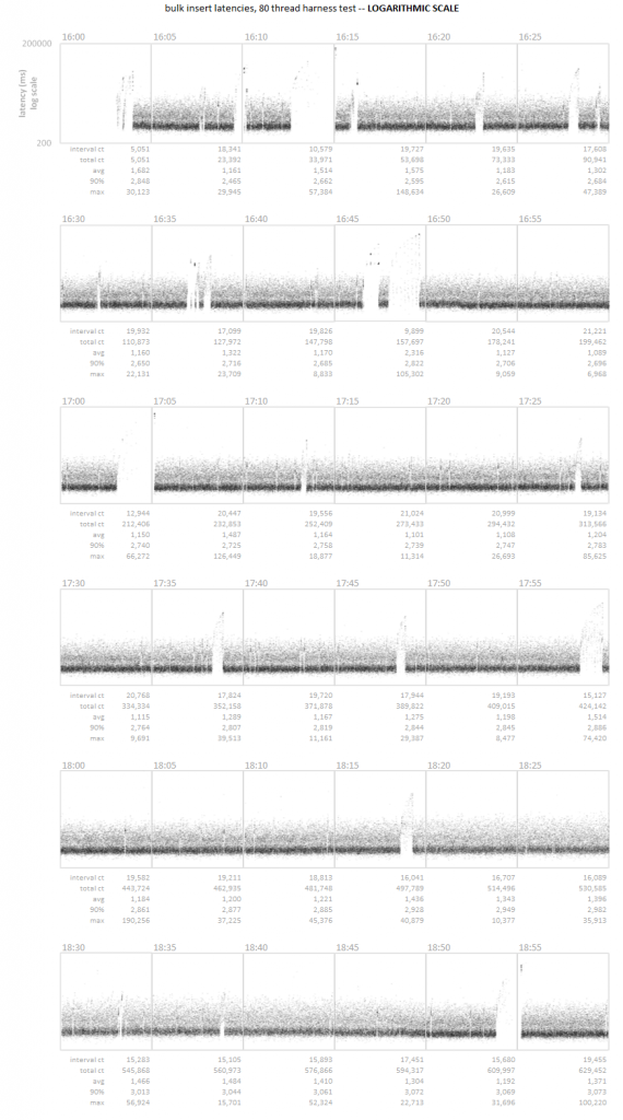
Time series scatter plot
A time series latency scatter plot that allows for the visualization of all transactional latency values captured over the course of three hours. In this particular case, the customer was unable to detect a series of micro-outages using their standard 5 minute sample interval. Visualizing the entire data set allowed for the rapid identification of the pattern.
In God we trust, all others must bring data.
w. edwards Deming
Edward Tufte has written extensively on the use of small multiples and sparklines. These concepts, the use of many small plots using a consistent pattern allows you to quickly survey large amounts of data for abnormal patterns. The concept focuses on how our eye can parse large numbers of micro plots and quickly assess an abnormal pattern – it’s an innate ability that all people have. We can leverage this ability by creating visualizations that present consistent patterns to the viewer, and subtly illustrate abnormalities that anyone can observe.
Continue reading
Time for a new twist on an old concept…the Gantt Chart. Tried and true, we’re used to seeing it used for old waterfall planning models. However, we can take a project chart for a large scale POC of an MDM application housing 250 million records on a new clustered database. The schedule was extremely aggressive with an original target of three weeks, which, due to delays in database deployments and JDBC/ODBC connectivity issues stretched to 5 weeks.
Can you build a visualization that conveys the complexity of a project involving a dozen technical people, hundreds of tests, with distinct goals?
Hey, I’m a data guy – you know what the answer is going to be…
And over the years, I’ve become convinced of one key, overarching fact about the ignorant mind. One should not think of it as uninformed. Rather, one should think of it as misinformed.
An ignorant mind is precisely not a spotless, empty vessel, but one that’s filled with the clutter of irrelevant or misleading life experiences, theories, facts, intuitions, strategies, algorithms, heuristics, metaphors, and hunches that regrettably have the look and feel of useful and accurate knowledge.
David Dunning
Do. Or do not. There is no try.
yoda
The message is that there are known knowns. There are things we know that we know. There are known unknowns. That is to say there are things that we now know we don’t know. But there are also unknown unknowns. There are things we don’t know we don’t know.
donald rumsfeld
Processor frequency gets the glory, but I/O bandwidth wins the game.
Tom Bradicich, PhD, Former IBM Fellow and VP