I’ve spent most of my career integrating, developing and tuning a variety of software and hardware products that support core infrastructure applications. For the past 10 years I have been able to focus on aggregating data across complex infrastructure stacks and developing techniques for enhancing our visual representation of these large scale data sets.
My philosophy has focused on viewing the entire data set for rapid assessment of the behavior of a system. This focus has been on the performance of high scale systems, mostly delving into low level profiling of transactional latency patterns for OLTP style applications. Though my ultimate goal is to provide rapid solutions to my customers for their performance issues, I also strive to make the representation of their data sets comprehensive, visual, clear, and interesting to view.
I’ve compiled a sample of some of the data visualization projects I have taken on over the years, applying a variety of techniques championed by Edward Tufte to these data sets. Hopefully you’ll find looking at these data visualizations as much fun as I had building them.

Some of my favorite visualizations
Click the title to see the graphic and description.
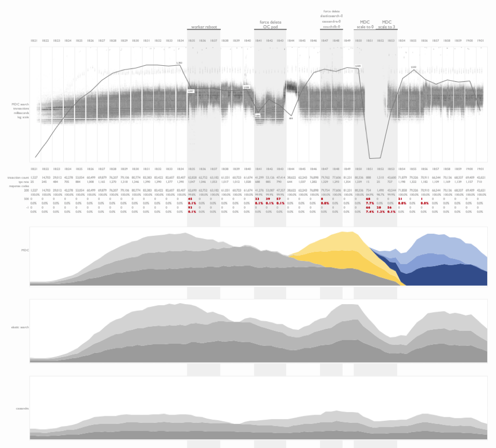
Fault injection testing on kubernetes
This is a time series summary of multiple layers of metrics during fault injection testing on a kubernetes deployment.
Project timeline and outcome
In this visualization I have combined combined a project timeline with test results from a workload profiling sequence following the deployment and tuning of an application on a clustered database environment for the first time. This is an information rich view of the project outcome that illustrates the progress made over the duration of the engagement. Tools like these are helpful in explaining software deployment cycles and the tuning investments required for at-scale projects.

Name token count regression study
An interesting example of the use of linear regression analysis to identify the normalized comparison latency for a person-search workload as the number of tokens in a name is increased. This experiment design was used to compare a baseline comparison function COMP1 to multiple tuning efforts of a new comparison, COMP2.

Weather data
This is an example of the visualization of daily weather readings spanning a decade’s worth of data from a weather station in Brazil. The objective of this plot was to identify seasonal weather patterns in a specific region and the subsequent replication of these patterns in a controlled environment.

Fault injection testing on DB2 Purescale
This visualization focused on illustrating the impact of fault injection during a cluster test. Faults include the soft and hard removal of nodes from a clustered database while three types of transactions were issued against a dataset stored on the cluster. Impacts to the workload were noted, as well as recovery times. Additional CPU metrics from the application and database tiers were presented below the transactional time series plots.

Impact of store openings on transaction rates
A transactional summary view of API calls from a B2C nationwide search workload. This visualization illustrates the ramp up of traffic (light gray) as the day progresses, and the stabilization of transactional search latency (dark gray) as the database buffer pools warm and the physical read rate drops. My favorite portion of this visualization is the illustration of the impact of store openings across time zones in the United States on the transaction rate.
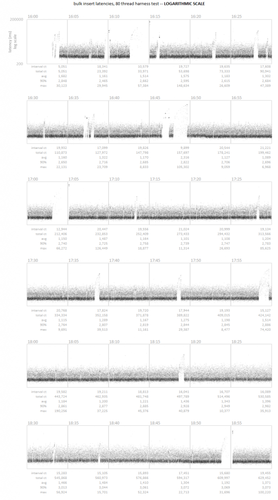
Time series scatter plot
A time series latency scatter plot that allows for the visualization of all transactional latency values captured over the course of three hours. In this particular case, the customer was unable to detect a series of micro-outages using their standard 5 minute sample interval. Visualizing the entire data set allowed for the rapid identification of the pattern.