I’m Jim O’Neill. My high school art teacher fundamentally changed the way I see the world. He taught me that what we call lines don’t actually exist, only two planes of color that intersect and give the illusion of one. I’ve been looking for those intersections in data ever since.
I work as a quantitative systems architect applying the scientific method to infrastructure: forming hypotheses about system behavior, designing controlled experiments, building models, and forecasting cost and risk decisions that engineering instinct alone can’t make.
Over the past two decades I’ve done this at scale: a decade building workload analytics for some of the world’s largest MDM deployments at IBM, handling billions of records and trillions of comparisons across Fortune 50 and federal accounts. And now, characterizing the behavior of a global SaaS fleet — digging into API performance, modeling new product workload impacts, building finance-facing deployment projections, and using infrastructure telemetry in ways it was never designed to be used.
My career didn’t start this way. I used to dissolve moon rocks for a living. The discipline required to extract a signal at parts per quadrillion concentrations from a sample you can never replace translates surprisingly well to finding anomalies in a production system you also can’t afford to break.
No lines, and no second chances.
Those two experiences are why this blog exists; from entity and workload analytics to cost intelligence, anomaly detection, and what it looks like when you apply lab science thinking to complex systems.
Often the most effective way to describe, explore, and summarize a large set of numbers – even a very large set – is to look at pictures of those numbers.
My high school art teacher communicated in words and exhales. A humf over your shoulder carried more than most people’s sentences. One day while sketching a still life I heard a humf over my shoulder. I looked up. He looked down over the frame of his reading glasses and asked me a question I wasn’t prepared for.
“I see a lot of lines on your drawing. Look around the room. Point to one line you see in the world around you.”
We looked around the room. The edge of a desk. The frame of a window. The corner where two walls met. I surveyed. He waited.
“There are no lines,” he said. “There are two planes of shades of color that intersect and give the illusion of a line.”
I put my pencil down and looked at the drawing differently. Every edge I had rendered as a line was actually a boundary; the place where two planes of different shade or color met. The line wasn’t a thing. It was a perception. The real information was in the planes themselves: their relationship, their contrast, the quality of the boundary between them.
I have been finding those intersections ever since.
How a geochemistry lab at Notre Dame became the origin of everything I do in infrastructure today.
The question I get most often when people learn about my background is some version of: how did you end up here?
The résumé looks like a series of hard left turns; geology, then network consulting, then a startup, then a decade at IBM, then SaaS infrastructure. The only non-developer on a software architecture team. It doesn’t look like a straight line.
But it is one. It just requires the right lens to see it.
I’ve spent most of my career integrating, developing and tuning a variety of software and hardware products that support core infrastructure applications. For the past 10 years I have been able to focus on aggregating data across complex infrastructure stacks and developing techniques for enhancing our visual representation of these large scale data sets.
My philosophy has focused on viewing the entire data set for rapid assessment of the behavior of a system. This focus has been on the performance of high scale systems, mostly delving into low level profiling of transactional latency patterns for OLTP style applications. Though my ultimate goal is to provide rapid solutions to my customers for their performance issues, I also strive to make the representation of their data sets comprehensive, visual, clear, and interesting to view.
I’ve compiled a sample of some of the data visualization projects I have taken on over the years, applying a variety of techniques championed by Edward Tufte to these data sets. Hopefully you’ll find looking at these data visualizations as much fun as I had building them.
Some of my favorite visualizations
Click the title to see the graphic and description.
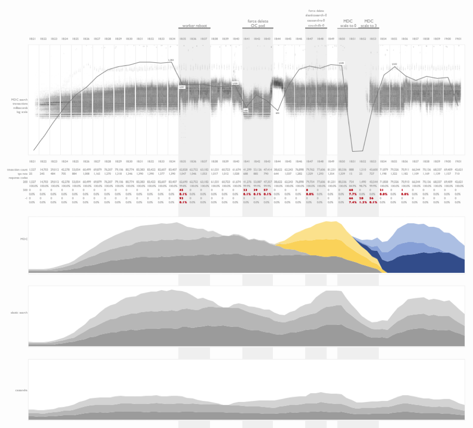
Fault injection testing on kubernetes
This is a time series summary of multiple layers of metrics during fault injection testing on a kubernetes deployment.
Project timeline and outcome
In this visualization I have combined combined a project timeline with test results from a workload profiling sequence following the deployment and tuning of an application on a clustered database environment for the first time. This is an information rich view of the project outcome that illustrates the progress made over the duration of the engagement. Tools like these are helpful in explaining software deployment cycles and the tuning investments required for at-scale projects.
Name token count regression study
An interesting example of the use of linear regression analysis to identify the normalized comparison latency for a person-search workload as the number of tokens in a name is increased. This experiment design was used to compare a baseline comparison function COMP1 to multiple tuning efforts of a new comparison, COMP2.
Weather data
This is an example of the visualization of daily weather readings spanning a decade’s worth of data from a weather station in Brazil. The objective of this plot was to identify seasonal weather patterns in a specific region and the subsequent replication of these patterns in a controlled environment.
Fault injection testing on DB2 Purescale
This visualization focused on illustrating the impact of fault injection during a cluster test. Faults include the soft and hard removal of nodes from a clustered database while three types of transactions were issued against a dataset stored on the cluster. Impacts to the workload were noted, as well as recovery times. Additional CPU metrics from the application and database tiers were presented below the transactional time series plots.
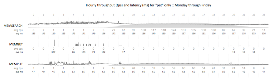
Impact of store openings on transaction rates
A transactional summary view of API calls from a B2C nationwide search workload. This visualization illustrates the ramp up of traffic (light gray) as the day progresses, and the stabilization of transactional search latency (dark gray) as the database buffer pools warm and the physical read rate drops. My favorite portion of this visualization is the illustration of the impact of store openings across time zones in the United States on the transaction rate.
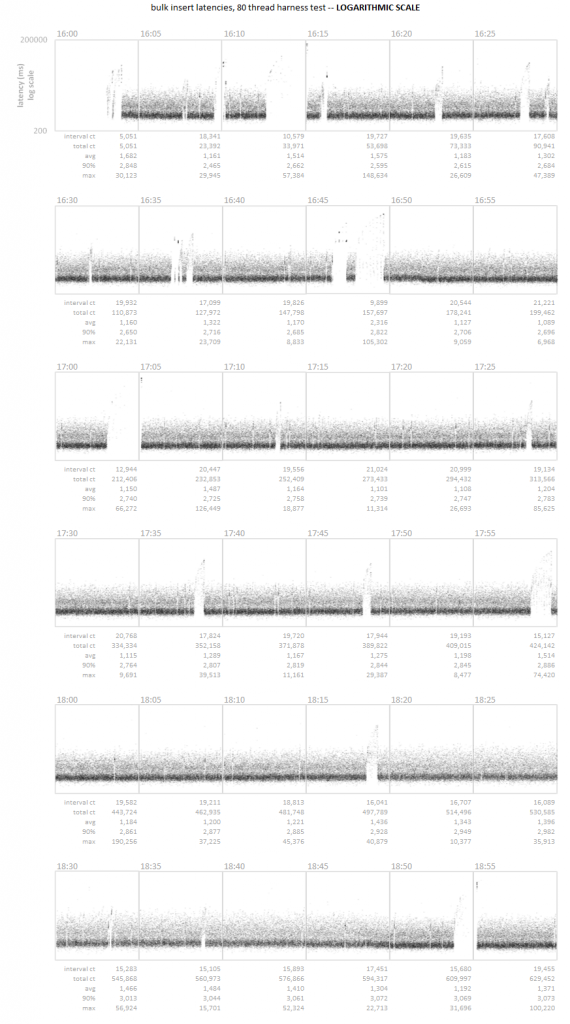
Time series scatter plot
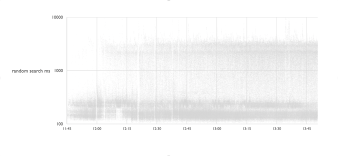
A time series latency scatter plot that allows for the visualization of all transactional latency values captured over the course of three hours. In this particular case, the customer was unable to detect a series of micro-outages using their standard 5 minute sample interval. Visualizing the entire data set allowed for the rapid identification of the pattern.
I keep three species of poison frogs (they are not poisonous in captivity – they are not on the same diet required to form their poisons) from the Ranitomeya genus:
Ranitomeya reticulata
Ranitomeya summersi “nominal”
Ranitomeya fantastica “nominal”
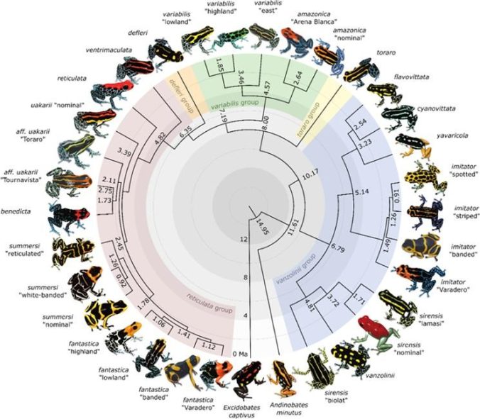
There was a recent reclassification of some species based on a phylogenomic analysis of the evolution of the Ranitomeya genus; the summary graphic from the article is beautiful and useful at the same time.
The world has achieved brilliance without wisdom, power without conscience. Ours is a world of nuclear giants and ethical infants. We know more about war than we know about peace, more about killing than we know about living.
Some men aren’t looking for anything logical, like money. They can’t be bought, bullied, reasoned, or negotiated with. Some men just want to watch the world burn.
Abraham Wald and his work on WWII bomber damage is a really cool story highlighting why we need to always challenge the way we look at data and consider what our data is really telling us, and what data we may be missing.
Google Sheets has native support for sparklines. This is more versatile than the Excel implementation, which has me torn – plotting in Excel is MUCH better than plotting in Sheets, but the sparklines in Sheets is better than Excel. I thought I would take you through an example of how I’m leveraging sparklines in Google Sheets in this post.
We’ve been keeping an eye on the reported cases coming out of our kids’ school district, Leander ISD. Living in Texas, the mitigation steps taken to contain the spread of COVID-19 is minimal:
an unenforced mask mandate
no social distancing
no pods / containment strategies for limiting contact in secondary school
no staggered bell schedules to reduce hallway crowding
no outside lunch options available for increased distancing
The relative lack of mitigation efforts alarmed us, so we started taking a closer look at what data was available from the district that we could use to better inform ourselves of what was going on in our school, and the schools around us.
And, when you analyze those situations, what you find is that we as humans simply have a profound inability to understand statistics and probability. It’s really that simple.
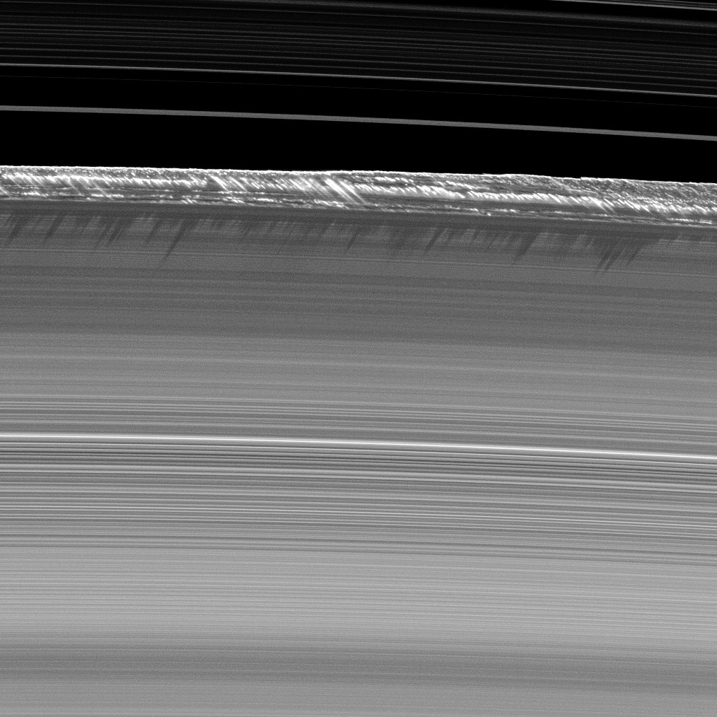
We were seeing details in the rings that were shocking. We just lacked the imagination that it would require to predict what it would look like.
Carolyn porco, cassini imaging science team lead
This wonderful quote highlights a key element in exploring complex systems – we have to approach our investigations with a wide open imagination, exploring all possible data sources so we can better understand what drives the systems around us.
Plotting all you data can be hard. Some think it’s pointless. Some think it’s a waste of time. Some think generic dashboards are better. Some think logging is more precise.
Nothing can replace a well designed scatter plot as a critical diagnostic tool.
Here’s a visualization of COVID19 average daily death rates compared to US wars. Approximately 866 Americans have died each day during the pandemic from COVID19, eclipsing the American Civil War’s average daily death rate of 449.
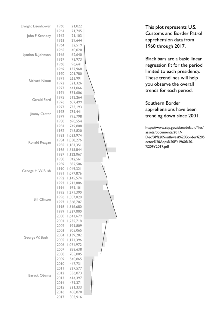
With all the talk about southern border security and a security crisis, I figured I’d poke around and see what data is available that illustrates long term trends in apprehensions along the southern border, and plot those statistics by presidency. Fun project, and I’ll burn through a few iterations of the graphic as I get some ideas. Here’s my first attempt:
So far the only trend I see is a sharp decline in apprehensions beginning with George W. Bush’s presidency and continuing through Barak Obama’s. The current apprehension levels on the southern border have not been seen since the Nixon era.
There’s likely multiple modifications I can make to the infographic. The trend line was a quick fit with a black line. It’s likely too heavy of a contrast and I’ll have to lighten that to fit the color scheme. I’m not sure I like the bar next to the president names. I think the alternating colors for different presidents on the bar graphs are likely sufficient rendering the vertical line redundant. I’d also like to add more summary statistics and maybe numerical representations of the trend numbers, but that could clutter the plot.
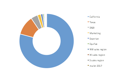
Donut plots that is – the new hot plot that has displaced the old pie chart. What is it with us and fatty dessert terms for terrible plotting concepts?
Donuts are a complete waste of space and are seemingly ubiquitous in dashboards these days. They serve little purpose other than to dilute data density while splashing useless color across an interface. Their complete lack of utility should have them outright banned from from the tool box of any serious data scientist.
So here’s a graphic I encountered recently:
There are a few problems here:
You have to roll over the graphic to see the actual numeric values.
You cannot read or see the smallest values.
If you are colorblind like me, you have a really hard time mapping the color to the legend.
Speaking of the legend, your eye is bouncing from left to right then back to the left each time you try to understand what value you are looking at.
In short, this “pretty” and “interactive” graphic requires the viewer to do a lot of work just to get a basic understanding of what is going on with the data. It’s exhausting, a waste of time, and a waste of pixels.
So let’s look at what we can do with a variant of a good old fashioned table with a few enhancements:
There are two ways to do great mathematics. The first is to be smarter than everybody else. The second way is to be stupider than everybody else — but persistent.
If you are like me, you remember the days from your childhood of free ranging far from home for hours on end without your parents really knowing where you were. Whether that was walking a mile to the ballpark for baseball practice, or taking a skiff a few miles from home to go out fishing in the bay, my parents rarely knew where I was most of the day. That type of parenting today would have you locked up.
This is a Q&A with a pair of researchers who conducted an interesting study on how moral judgement impacts policy / lawmaking surrounding the regulation of parenting. It’s a very in depth look at the class implications of these new regulations; an interesting blend of behavioral sciences and perceived versus actual risk.
A humorous yet low tech and possibly effective method for warding off lion attacks on cattle herds in Africa – painting eyes on the rear ends of cows. The study is in it’s initial phases, but it looks promising. It also illustrates that the most simple of solutions can be the most effective; something we need to consider in our analytics methodologies.
This was a really beautifully done article on Sumo wrestling with some very well constructed infographics that followed Tufte’s principles of information design quite closely. Here’s an example of one of the graphics:
You can read the full article with more graphics here:
I came across this plot the other day while reading an article about LinkedIn on fastcompany.com. What struck me (other than the poor labeling on a vertically oriented phone) was the lack of significance of the vertical sort on the plot. Continue reading
As a performance data scientist, my day job is about finding non-obvious data access patterns in workloads. These patterns can be leveraged to tune a system, or learn more about the behaviors of users driving these workloads. We can often tell a lot from the metadata without seeing the contents of the transactional data which may contain private or sensitive data. This leads us to develop broad transitional profiling methodologies that allow us to provide feedback loops into applications to self-tune configurations to optimize the cost of running a workload, or in some cases, provide insights back to operators about their users and their usage patterns.
A really cool decision tree from NASA’s Apollo program. It gets you thinking about how to incorporate well vetted, seemingly forgotten process flows into current procedures like automated cluster monitoring and alerting.
This is a great example (in between the cussing) that highlights the danger of entity linking rules that glue people together based on limited data, or in some cases, a single attribute, like SSN.